3. Basic visualization of 2d data
3.2. pyplot from matplotlib
Now let’s visualize the data we now know how to read. We’ve already imported the netCDF4 package above. Now we will import pyplot which is a sub-package of matplotlib.
We could just import the package like this
[2]:
import matplotlib.pyplot
but to use it is rather cumbersome
[3]:
matplotlib.pyplot.plot([1,3,2]);
So we will import pyplot with an alias “plt” as follows:
[4]:
import matplotlib.pyplot as plt
Here, plt is a shorthand for pyplot that is widely used but you can use whatever alias you like.
Normally, we would put this import statement at the top of the notebook with the other imports.
Let’s look at the 2005 World Ocean Atlas temperature data on a 5\(^\circ\)x5\(^\circ\) grid, served from IRIDL:
[5]:
nc = netCDF4.Dataset('http://iridl.ldeo.columbia.edu/SOURCES/.NOAA/.NODC/.WOA05/.Grid-5x5/.Annual/.mn/.temperature/dods')
And let’s load the coordinates and sea-surface temperature into variables:
[6]:
lon = nc.variables['X'][:]
lat = nc.variables['Y'][:]
sst = nc.variables['temperature'][0,:,:]
Note that the [:] forced the reading of the data. Leaving the [:] out would have returned an object and deferred reading of the data which is generally considered better form. Here, I chose to force read so that the data is not repeatedly fetch across the Internet connection.
There are two main ways of looking at 2D data.
- Contours
plt.contour()Draw contours of constant values. Contours are colored by default.plt.contourf()Draws bands of constant color between contours of constant value.
Use plt.clabel() to label contours. 2. Psuedo-color shading of value at data locations. - plt.pcolor() Colored pixels for each data value. - plt.pcolormesh() is optimized for quadrilateral data and thus faster. It also understands curvilinear grids better than pcolor().
Use plt.colorbar() to add a color bar.
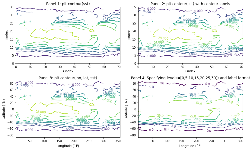
Here are four variants using plt.contour() with different arguments (given in the title of each pane):
[7]:
plt.figure(figsize=(12,7)); # Makes figure large enough to see four panels (optional)

# 1. Contour without coordinate value
plt.subplot(221);
plt.contour(sst);
plt.xlabel('i index');
plt.ylabel('j index');
plt.title('Panel 1: plt.contour(sst)');

# 2. As above but with contour labels
plt.subplot(222);
c = plt.contour(sst);
plt.clabel(c);
plt.xlabel('i index');
plt.ylabel('j index');
plt.title('Panel 2: plt.contour(sst) with contour labels');

# 3. Contour with coordinates
plt.subplot(223);
c = plt.contour(lon, lat, sst);
plt.clabel(c);
plt.xlabel('Longitude ($^\circ$E)');
plt.ylabel('Latitude ($^\circ$N)');
plt.title('Panel 3: plt.contour(lon, lat, sst)');

# 4. Contour with coordinates and specific contour levels
plt.subplot(224);
c = plt.contour(lon, lat, sst, levels=[0,5,10,15,20,25,30]);
plt.clabel(c, fmt='%.1f');
plt.xlabel('Longitude ($^\circ$E)');
plt.ylabel('Latitude ($^\circ$N)');
plt.title('Panel 4: Specifying levels=[0,5,10,15,20,25,30]) and label format');

plt.tight_layout()
And here are variants of plt.pcolor() and plt.pcolormesh().
In the following examples you will not notice any difference between pcolor and pcolormesh but pcolormesh is the preferred method for i) efficiency and ii) flexibility with curvilinear grids.
[8]:
plt.figure(figsize=(12,7)); # Makes figure large enough to see four panels (optional)

# 1. Simple pcolor
plt.subplot(221);
plt.pcolor(sst);
plt.colorbar();
plt.xlabel('i index');
plt.ylabel('j index');
plt.title('Panel 1: plt.pcolor(sst)');

# 2. Simple pcolormesh
plt.subplot(222);
plt.pcolormesh(sst);
plt.colorbar();
plt.xlabel('i index');
plt.ylabel('j index');
plt.title('Panel 2: plt.pcolormesh(sst)');

# 3. pcolormesh with cell-centered coordinate value
plt.subplot(223);
plt.pcolormesh(lon, lat, sst);
plt.colorbar();
plt.xlabel('Longitude ($^\circ$E)');
plt.ylabel('Latitude ($^\circ$N)');
plt.title('Panel 3: plt.pcolormesh(lon, lat, sst)   CAUTION!!!');

# 4. pcolormesh with mesh coordinates value
plt.subplot(224);
mesh_lon = numpy.linspace(0,360,lon.shape[0]+1)
mesh_lat = numpy.linspace(-90,90,lat.shape[0]+1)
plt.pcolormesh(mesh_lon, mesh_lat, sst, vmin=0, vmax=30, cmap=plt.cm.cividis);
plt.colorbar(extend='both');
plt.xlabel('Longitude ($^\circ$E)');
plt.ylabel('Latitude ($^\circ$N)');
plt.title('Panel 4: plt.pcolormesh(mesh_lon, mesh_lat, sst, vmin=0, vmax=30)');

plt.tight_layout()
VERY IMPORTANT NOTE: In panel 3 above, we pass the coordinates of the data locations to pcolormesh and you should notice that the top row and right column of values are not plotted!!! This is because pcolormesh expects the coordinates of the mesh, or cell boundaries, which should have one extra column and row of values than does the data. In panel 4, I make up appropriate mesh coordinates using numpy.linspace().
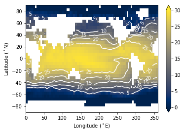
To finish up, we can also combine pcolormesh and contour plots…
[9]:
mesh_lon = numpy.linspace(0,360,lon.shape[0]+1)
mesh_lat = numpy.linspace(-90,90,lat.shape[0]+1)
plt.pcolormesh(mesh_lon, mesh_lat, sst, vmin=0, vmax=30, cmap=plt.cm.cividis);
plt.colorbar(extend='both');
c = plt.contour(lon, lat, sst, levels=[5,10,15,20,25], colors='w')
plt.clabel(c, fmt='%.0f')
plt.xlabel('Longitude ($^\circ$E)');
plt.ylabel('Latitude ($^\circ$N)');
3.3. Summary
- Import matplotlib.pyplot with
import matplotlib.pyplot as plt - Contour with
plt.contour()andplt.contourf() - Shade with
plt.pcolormesh() - Also used
plt.colorbar(),plt.xlabel(),plt.ylabel(),plt.clabel()